Visualisation of the ‘Optimal Cerebral Perfusion’ landscape in severe TBI patients
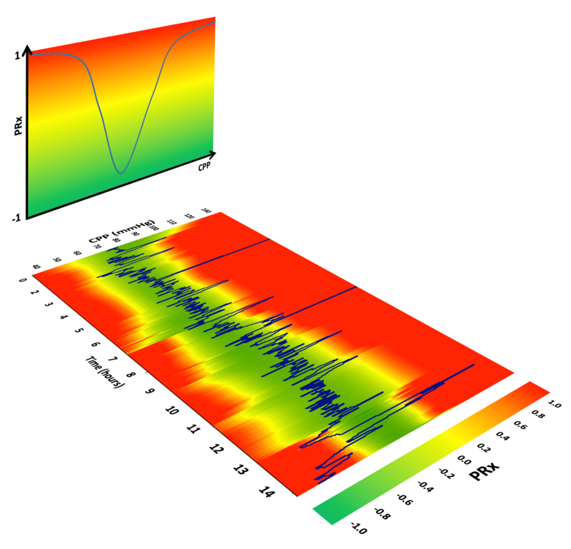
Figure 1 The concept of visualisation of CPPopt.
Severe traumatic brain injury (TBI) is a major cause of global morbidity with a quarter to a third of patients dying as a result of the injury. Since TBI pathophysiology is heterogeneous across patients and over time, one attractive avenue is to individualize patient management during intensive care admission. The cerebrovascular pressure reactivity index (PRx) has been proposed as a guide for individualizing CPP management. In this autoregulation based technique, PRx (the moving correlation between slow fluctuations in MAP and ICP over a 5 minute window) is plotted against hourly trends in CPP to create a U-shaped CPP-PRx curve outlining the CPP at which pressure reactivity is more efficient – the CPPopt (please see also CPPopt trends page). This procedure is applied iteratively on moving calculations on recent patients’ data to provide (semi) continuous CPP-PRx curves and CPP targets.
A single value of CPPopt does not fully reflect the character of the CPP-PRx relationship, nor does it capture its dynamic nature, even when plotted as a time trend. In addition, the CPPopt trends tend to be fairly ‘erratic’ (noisy), and may often contain many gaps where the CPP-PRx curves cannot be robustly fitted (please see also CPPopt Trends page). These effects are likely to be detrimental to the process of clinical introduction of the autoregulation guided CPP therapy.
The objective of the new visualization function is to find a way of improving the CPPopt methodology by introducing a new method that may provide insight into the complete characteristics of the CPP-PRx relationship, and its temporal evolution [1,2]. In short, time-averaged means for CPP and PRx are stored with a time resolution of 1 minute. CPP-PRx curves and the corresponding CPPopt values were calculated every minute, with a calculation data window spanning 4 hours. The sequential CPP-PRx curves are then used to create a colour-coded map of CPP-PRx relationship evolution over time. Smoothing is used to create a continuous time trend. The time (horizontal) axis represents the position of the moving window for the CPPopt calculation (figure 1 and 2). For example figure 2 shows a PRx-CPPopt landscape of a patient that started off with global loss of autoregulation, then on day 2 the autoregulation seemed to have recovered but only for a relatively narrow and high (75-90 mmHg) range of CPPs. Subsequently, from day 3 onwards autoregulation recovered over a broad range (55-75) of CPP (figure 2).
Although further technical improvements and a test of functionality are needed, the proposed visualisation, while addressing some of the problems of the CPPopt methodology, may improve individual CPP management methods based on the status of cerebral autoregulation, current and past.
At the moment some additional modifications in the software have to be made to make this function fully operational. Figure 3 shows the CPPopt landscape in the current software release (ICM+, version 8.3). Please visit the site regularly to be up-to-date:)
The landscape figure (figure 3) shows:
- X-axis: time (in hours)
- Y-axis: CPP values (mmHg)
- The patients’ CPP time trend (blue line)
- PRx- colour map (background more or less dichotomized into ‘working’ (green) and ‘impaired’ (red) cerebrovascular pressure reactivity)
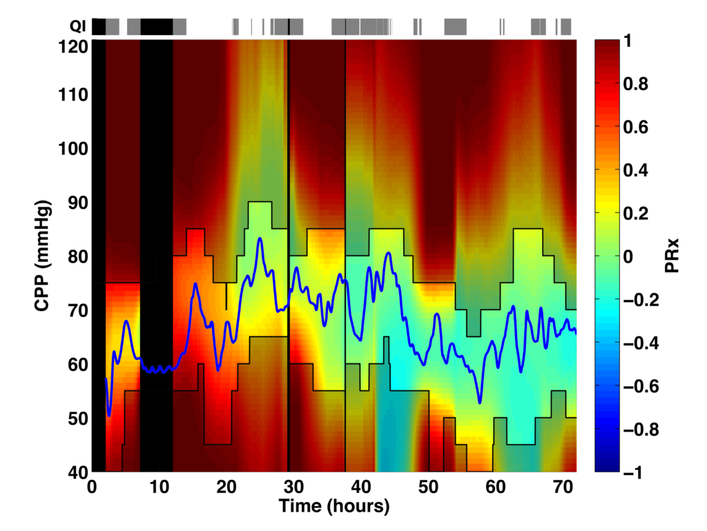
Figure 2 The landscape figure shows a TBI patient that started off with global loss of autoregulation, then on day 2 the autoregulation seemed to have recovered but only for a relatively narrow and high (75-90 mmHg) range of CPPs. Subsequently, from day 3 onwards autoregulation recovered over a broad range (55-75 mmHg) of CPP. The blue line represents the patients’ CPP trend over time. The black lines represent the CPP range that is covered by the true CPP-PRx curves. The quality indicator (QI) on top shows grey bars indicating interpolated PRx-CPP landscapes (with exponential smoothing) and black bars representing absence of landscape data due to set smoothing criteria. [1,2]
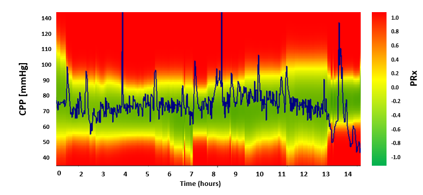
Figure 3 CPPopt landscape plot with limited features available in the latest ICM+ software update (2017). Patients’ CPP is shown as a bleu line.
References
[1] Aries MJ, Wesselink R, Elting JW, Donnelly J, Czosnyka M, Ercole A, Maurits NM, Smielewski P. Enhanced Visualization of Optimal Cerebral Perfusion Pressure Over Time to Support Clinical Decision Making. Crit Care Med. 2016 Oct;44(10):e996-9.
[2] Ercole A, Smielewski P, Aries MJH, Wesselink R, Elting JWJ, Donnelly J, Czosnyka M, ,Maurits NM. Visualisation of the ‘Optimal Cerebral Perfusion’ landscape in severe brain trauma patients. In Intracrnial Pressure and Brain Monitoring. Springer Verlag. 2017 [accepted for publication]